Photography


Working in the Closet: The stunning works of Vivian Maier

1954, New York source: http://www.vivianmaier.com/gallery/street-2/#slide-12

Vivian Maier, New York, 1954

Maybe you haven’t heard about Vivian Maier yet. The story goes like that: As a nanny, Vivian Maier worked for different families in the 1950s and 1960s, mainly in Chicago and New York. That was her official profession. Shortly after her death in 2009 John Maloof, an amateur historian, bought some boxes of unknown content in hope of finding some relevant material for a local history project. What he discovered when he unpacked the boxes was what every art historian dreams of: Thousands of photo negatives which could easyly compete with the most iconic street photographers in that times. It was quite a big deal and so many questions aroused: Why didn’t she tell anyone about the photos? Why didn’t she develop the negatives? Why did she make such a secret of it? In fact she took the photos and just stored them her room. It’s quite probable that she didn’t even SEE most of the photos as we can today because she didn’t develop them.

Documentaries on Vivian Maier

There are some documentaries about Vivian Maier. One is “Finding Vivian Maier” from John Maloof, the other one is “Who took nanny’s pictures” from the BBC archive. Although I must say that John Maloof’s documentary to me seems to be like kind of a commerical about Vivian Maier and I am sure that the film contributed a lot to John Maloof’s success in spreading the news about his discovery. But if you want to hear the story “first hand” it’s nice to be told by Maloof himself. The New York Times reported about Maier, many newspaper did.

The photos

Within all this I was asking myself: Why is it actually that we would say her photos are brilliant, outstanding? Why are they exhibited in galleries and in museums throughout the world meanwhile? Bluntly asking: What is it that makes her photos so outstanding? Having that in mind, let’s have a look at her above photo:

Looking disdainfully towards us the white boy is leaning his arm on his knee as if to say: “Get away!” But we can’t. So we are watching the following scene: A black boy is kneeing in front of the white boy whose left shoe is waiting to be cleaned by the lower positioned one. At second sight we see a man sitting at the end of the shopping window in exactly the same pose: Shoe standing on a bench and holding his arm in the same way as the young boy does in the foreground. Immediately one might think: Like the father, like the son? It makes you reflect what is happening in the picture. That is one of the fascinating things about Maiers’ photos: When you look at her photos you come up with questions then can’t be explained within the context of the photo. It makes you think about society and how unequal things are. Her photos are a social comment. If we look at the young boy’s expression we could wonder why he looks so disgusted. Or is it us that IS disgusted by what we see?

Maier is not refraining to take photos on controversial topics. Her photos can be read as comments and as a critique. She turns her camera towards things that people usually turn away from. In that regard similarities can be drawn to Robert Frank’s “The Americans”. But what it makes all more complicated is, that we cannot even say she criticized society because she didn’t develop the photos. That leaves us again with a question: Why was she doing all this if not to SHOW people? As the Hamburg art historian Wolfgang Kemp stated she knew well about contemporary photography and that she could have get professional advice if she wanted to. However, Maier still preferred not to develop the negatives. In her photos she shows such a precision and perfection in composition and such a security in how to come to the essence of what makes the photo outstanding that you can call her photos “merciless”[1]. Merciless because they have no pitty. Merciless because they still have this perfect composition. The photos are just taken for the sake of being taken. Merciless because they don’t aim at improving the situation.

If you have the time, go and check out the website from John Maloof to explore more of her works. You’ll be surprised.

[1] Wolfgang Kemp, FAZ, 2011.

source of photo: http://www.vivianmaier.com/gallery/street-2/#slide-12


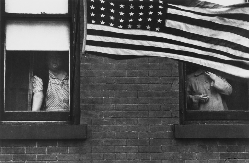
Looking closely: What is so special about the photography “Parade Hoboken” from Robert Frank?

Parade Hoboken, 1955, New Jersey, from looking in: Robert Frank’s The Americans published by Steidl. Photograph: Robert Frank/Steidl


Although Robert Franks’ photos later became “American classics” and Icons of American Photography” that was not exactly the case when the photo book “The Americans” was published the first time in America in 1959. The reactions on his photos went from “A sad poem by a sick person” (as quoted by NPR) to “wart-covered” or “warped” (New York Times). But why was that?

To find out we are going to have a close look to one of the most famous photos of “The Americans”: “Parade Hoboken” which Frank captured in New Jersey in 1955/56 during his two years journey through the American States on his Guggenheim fellowship. The photo is a picture in a picture: We see two women each of them framed by a window. We do not see there faces. The face of the one in the left window is swallowed by the room’s darkness, her mouth is nearly blurred out. We just know it is there because it must be there. The face of the women on the right is covered completely by the asymmetric stripes of the American flag. She can’t neither see the photographer nor can she see much of the parade, nor does she care or move an inch to do something against it. It seems as if she is closing up her coat, her left hand looks like a claw which is irritating. Maybe she is leaving soon for the parade. Also the women in the left window is irritating in a way because we cannot see her face and her mouth is blurred out. Apparently she is wears her house dress which does not look like she would go out to join the parade. Both of them are not individualized, we don’t see any individual streak. In contrast to the American banner the bricks in the wall repeat themselves in an imperfect manner. The American flag is cut off to the half. We see some stars on the banner but not all of them.

But it is actually due to the flag that we assume this to be a patriotic event. It’ s the only object in the photo which refers to an official act – apart from the title. Given that this is apparently a national holiday parade, what Robert Franks shows us here has not much to do with what we would assume to be a celebrated, national event: What we see is two women looking out the window and being prevented from doing so by the American flag. In opposition to what the caption says, we in fact are NOT seeing much of the parade. We see tristesse and certainly not what is known as sharing the American dream. Ed Ruscha, at that time a young artist, said about the book: “I’d never seen anything like it. Robert Frank came out here and he just showed that you could see USA until you spit blood.” In fact critics would say that the pictures are  asymmetrical and blurred. A fact that to an eye which was used to see sharp and perfect photos in magazines was difficult to handle. According to Robert Frank the Museum of Modern Art even refused to sell the book.

But there was a young generation. The generation of Ed Ruscha who got inspired deeply by Frank’s book and who appreciated it for showing a completely new approach to photography as Ed Ruscha says: “It’s like – You know where you were when John F. Kennedy was shot? I know where I was when I saw ‘The Americans’ […] I was aware of Walker Evans’ work. But I felt like those were still lives. Robert’s work was life in motion.” This life in motion and this new look on things was perfectly captured in Jack Kerouac’s introduction for “The Americans”. Kerouac had just published his famous book “On the road” and was praised by critics. Robert Frank read the book, found out that they had in common “the love of America”. It was Frank who asked Kerouac if he could write the introduction to “The Americans”. “Sure, I can write something”, was the reply.

What is so special about Franks’ photos is that he realized things and NOT looked away from them. Robert Frank says about his images: “I photographed people who were held back […] My sympathies were with people who struggled. There was also my mistrust of people who made the rules.” His wife describes this ability of taking photos: “It’s ‘What’s going on here?’ None of us know until he takes a photograph…” It is exactly in this way that Robert Frank chose to question the American Dream and to make people reflect on society and its rules. He does not turn away from what other people do not want to see.


All direct quotes are taken from the very, very good article about Robert Frank in the New York Times.


Mistrust your eyes. A plea for a careful reading of photography

Source: Library of Congress: http://loc.gov/pictures/resource/fsa.8b29516/


Dorothea Lange and “Migrant Mother”, 1936.

Do you happen to know this photo from Dorothea Lange? It takes us straight to the 1930s rural America. An America which was hit badly by an economic recession. An America which was used to see foreign migrants seeking for jobs. But this kind of economic crisis after the Great Depression was different. To the migrants came thousands of  “American” people who had to give up their farms due to drought and new laws and moved to California in desperate hope for work. At the same time the government with Roosevelt as its president invented programs to make people find jobs and to help them to build up a new life. This agenda, one part of the so called “New Deal”-Politic, was highly controversial. So, the government decided to send out photographers under the name of “Farm Security Administration” (FSA) in that region to document how the situation REALLY is like. The aim of the FSA was to show “the city people what it’s like to live on the farm.”

So, what do we actually see?

Not much of a farm, though. We see a women looking worried in the distance, frowning, her chin propped up. Her upper arms are covered with tattered clothes. The skin of her arms show dirty marks. What fascinates me about this photo is that her dignity is not at all disturbed by its surrounding poverty. Two of her kids hide their faces behind her shoulder; a little baby sleeps almost unseen on her arm. The light let the mother’s face become centric point of the composition. In the foreground a small object extends into the photo. We don’t see much of the background or in which place exactly the photo has been taken. It’s just us and the family. But why is the mother alone with her three children, where is the father? One might ask.

The caption, added by the FSA, tells us: “Destitute pea pickers in California; a 32 year old mother of seven children. February 1936”. That’s interesting because it perverts the facts and it omits some. Dorothea Lange originally invented a different subtitle saying: “Migrant agricultural worker’s family. Seven hungry children. Mother, age 32. Father is native of California. Destitute in pea pickers Camp, Nipomo, California, because of the early pea crop. These people had just sold their tent in order to buy food. Of the 2,500 people in this camp, most of them are destitute.”

It’s an interesting detail that the government needed pictures showing destitute pea pickers, so it was just too easy to let “agricultural workers” become “pea pickers” to fulfil their purposes. After sending the photos to the “San Francisco News” in March 1936 it’s thus no surprise to find them reporting that the government was just informed about this miserable circumstances by a “coincidental” visit of a photographer but – thanks to the New-Deal-politic, the reader might think – help is already on its way to the camp. The headline would ask: “What does the ‘New Deal’ mean to this mother and her children?”

There was also a long discussion about the “detail” which is extending in the photo. It’s the post of the tent and Lange apparently wanted it to be removed from the photo. The FSA insisted on leaving it where it was since that would prove the documentary, authentic style of the picture. So this little detail was very useful to the FSA in proving the photo’s authenticity.

Do you see what I mean? What the photo is actually telling us totally depends on the circumstances under which we are looking at it. We still see a strong, dignified mother bearing a lot of responsibility but at the same time a confidence that leaves no doubt to us that she will find a way out of that misery. But as Dorothea Lange was receiving a salary by the FSA, her photos have to be read in that regard as well. Although Lange was saying “We were after the truth,” her photos have a political intention. They pretend to depict what was happening in 1930s rural America. But what they are showing us is a rural America in the way the Farm Security Administration wants it to be perceived. To say it with Pierre Bourdieu: This photography shows us a tautology. That is, it depicts an apparent reality that corresponds exactly to the reality which was formulated BEFORE to BE the reality. In other words the photography provides the evidence of what was told to be the truth through radio and newspapers. The shocking effect “Migrant Mother” had above all, was that it totally mocked the American dream of security and independence and opportunity in which every child has been taught to believe. In that way the photo aimed to stimulate feelings and to engage the observer emotionally. People couldn’t look away anymore. They have seen their faces.

What do you think? Is there such a thing as “neutral” photography?


Dorothea Lange (1895-1965) was an American photographer working for the Farm Security Administration in the 1930s and in that role documenting the life and work of migratory farm workers. Her works are categorized under “social documentary photography”. A fact Lange didn’t like much. Migrant Mother is Lange’s most famous photo. It spread through the newspapers and became the metaphor of a nation in crisis.

Lange_car


Image source: Library of Congress: http://loc.gov/pictures/resource/fsa.8b29516/